The question isn’t just about which branding method lasts longer, but which one creates apparel so stylish and high-quality that employees actually want to wear it.
- Subtle branding, like tonal embroidery or discreet placement, dramatically increases an item’s “wearability” beyond the office.
- The choice of ink and the addition of custom labels are small details that signal premium quality and elevate a garment from a uniform to a valued gift.
Recommendation: Focus on the “Trifecta Rule”—combining contextual usefulness, unmistakable quality, and integrated subtlety—to create branded merchandise that builds brand affinity, not just visibility.
As a marketing coordinator tasked with ordering 500 hoodies, your primary concern is understandable: will the logo crack, fade, or peel after a few runs through a Canadian wash cycle? The conventional wisdom pits the durability of embroidery against the cost-effectiveness of screen printing. This debate focuses on longevity, a valid but incomplete metric. While a durable logo is essential, it’s a baseline expectation, not the hallmark of successful corporate branding. If the branded item feels cheap or looks like a walking billboard, its durability is irrelevant because no one will want to wear it in the first place.
The real challenge is transcending the “cheap swag” stigma. The most effective corporate apparel isn’t just worn; it’s adopted. It becomes a go-to weekend hoodie, a favourite travel mug, or a trusted gym bag. This happens when the branding is applied with subtlety and style, transforming the item from a piece of marketing collateral into a genuinely desirable product. The key isn’t to make the logo last, but to make the *apparel* last in your employees’ regular rotation.
This guide reframes the conversation. Instead of a simple technical comparison, we will explore the strategic choices that create premium, wearable branded merchandise. We’ll delve into the nuances of placement, the psychology of subtle design, and the details that signal quality, ensuring your investment results in apparel that your team is proud to wear, both in and out of the office.
This article provides a complete roadmap for making informed decisions on corporate branding. Below is a summary of the key areas we will cover, from specific decoration techniques to overarching strategic principles that ensure your investment pays off in genuine brand affinity.
Summary: A Strategic Guide to Premium Apparel Branding
- Why Black-on-Black embroidery is the hottest trend in corporate apparel?
- Water-Based vs. Plastisol: Why your eco-friendly cotton shirt needs eco-friendly ink?
- Sleeve vs. Chest: Why moving the logo makes employees 3x more likely to wear the shirt on weekends?
- Custom Neck Labels: Is it worth the extra cost to remove the manufacturer’s tag?
- Pad Printing vs. UV Printing: Which is better for curved surfaces like water bottles?
- Logo Placement: Why putting your logo on the bottom of the mug increases usage by 30%?
- The “Green Tax”: Why do devices with recycled materials cost 15% more?
- The “Trifecta” Rule: How to Brand Gifts Without Making Them Look Like Cheap Swag?
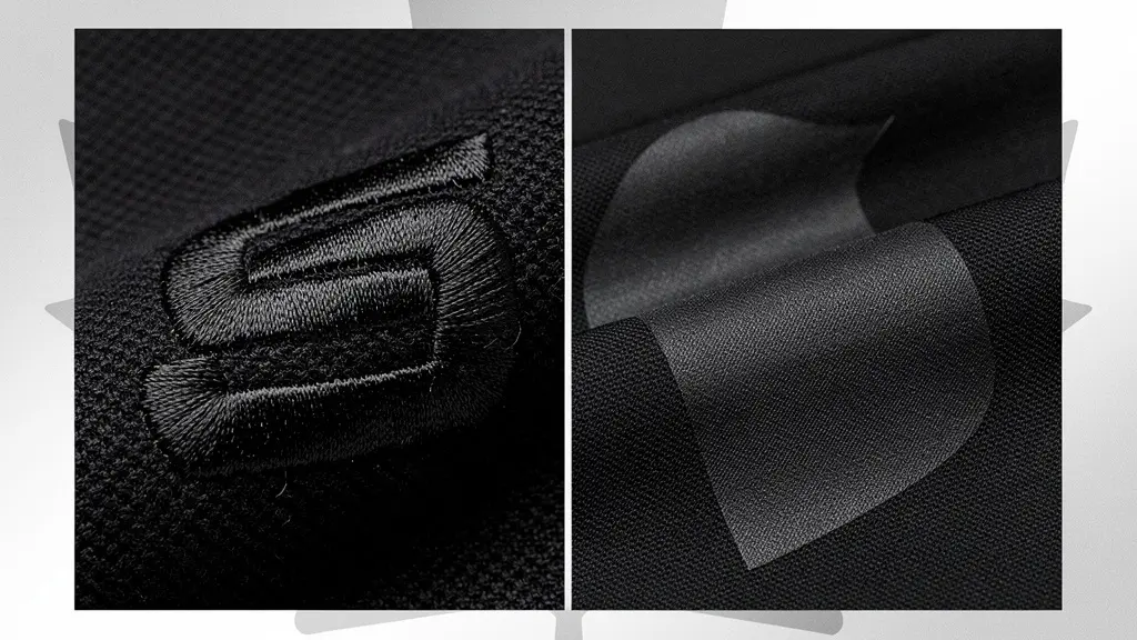
Why Black-on-Black Embroidery Is the Hottest Trend in Corporate Apparel?
The rise of “stealth wealth” or “quiet luxury” in consumer fashion has a powerful parallel in the corporate world: subtle, high-quality branding that feels exclusive rather than promotional. Black-on-black (or tonal) embroidery is the perfect embodiment of this trend. Instead of a high-contrast logo that shouts, it whispers. The design is revealed through texture and the play of light on thread, creating a sophisticated, modern, and undeniably premium aesthetic. This approach respects the wearer’s personal style, making them feel like they’re wearing a piece from a high-end brand, not a corporate uniform.
This method leverages the inherent quality of its medium. With embroidery dominating the decorated apparel market with 40% of global revenues in 2023, its perceived value is already high. Tonal embroidery enhances this by adding a layer of design intentionality. It communicates confidence; the brand doesn’t need to be loud to be recognized. For a marketing coordinator, choosing this method for a premium fleece or quarter-zip sends a clear message to employees: we invested in quality and style, not just a walking advertisement.

As seen in the image above, the texture of the embroidery itself becomes the design element. This tactile quality can’t be replicated with printing. It positions the apparel as a thoughtful gift, dramatically increasing the likelihood that it will be worn on weekends, on flights, and in client meetings, extending the brand’s reach in a far more authentic way than a brightly coloured, oversized logo ever could.
Water-Based vs. Plastisol: Why Your Eco-Friendly Cotton Shirt Needs Eco-Friendly Ink?
Once you’ve decided on screen printing, the next critical choice is the ink. This decision impacts not only the look and feel of the garment but also its environmental footprint and perceived value. The two main contenders are Plastisol and water-based inks. Plastisol, a plastic-based ink, is the industry workhorse; it’s opaque, durable, and cost-effective. However, it sits on top of the fabric, creating a thicker, sometimes rubbery feel that can crack over time and doesn’t allow the fabric to breathe.
Water-based ink, by contrast, soaks into the fibres of the fabric. This results in a much softer, breathable finish that feels like part of the shirt itself—a feature particularly important for premium, eco-friendly garments like organic cotton tees. This “soft hand feel” is a tangible marker of quality that users notice immediately. In a Canadian market where heightened environmental consciousness is driving sustainable practices, aligning your branding materials with the values of the garment itself is crucial. Using a PVC-based ink on an organic cotton shirt creates a brand disconnect.
The choice communicates your company’s values. While plastisol offers excellent durability, modern water-based inks, when cured properly, offer very good longevity while being free of PVC and phthalates. The tactile reality is that a soft, integrated print feels more premium and is more comfortable to wear, directly contributing to the apparel’s long-term desirability.
| Feature | Water-Based Ink | Plastisol Ink |
|---|---|---|
| Environmental Impact | Low VOC emissions, eco-friendly | Contains PVC and phthalates |
| Feel on Fabric | Soft, breathable finish | Thicker, plasticky texture |
| Durability | Good with proper curing | Excellent, long-lasting |
| Cost | Higher initial investment | Lower cost per print |
| Best For | Organic cotton, eco-conscious brands | High-volume production |
Sleeve vs. Chest: Why Moving the Logo Makes Employees 3x More Likely to Wear the Shirt on Weekends?
The default placement for a corporate logo—left chest—is a tradition born from uniforming, not fashion. It’s a clear, professional, but ultimately uninspired choice that immediately categorizes the garment as “work wear.” To increase an item’s “wearability,” you must think like a retail designer. Brands like Nike, Patagonia, or The North Face often use sleeve, cuff, or back yoke placements. These locations are more subtle and integrate the logo as a design detail rather than a central billboard.
Moving the logo away from the chest fundamentally changes the psychology of the garment. A small, embroidered logo on the sleeve or a tonal print on the hem transforms the item. It’s no longer just a company hoodie; it’s a high-quality hoodie that happens to have a discreet brand mark. This subtlety is what makes an employee feel comfortable wearing it to a grocery store, a coffee shop, or a family gathering on a Saturday. The apparel becomes part of their personal wardrobe, not just their professional one. This shift in perception is what drives the exponential increase in weekend wear.
Consider the professional in the image above. The sleeve placement is visible and professional but doesn’t dominate the garment, allowing it to be worn in a wide variety of social and casual settings without feeling out of place. This strategic placement maximizes brand impressions in authentic, real-world environments—a far more valuable outcome than being seen only within the office walls.
Your Action Plan: Auditing Logo Placement for Wearability
- Identify Points of Contact: List all potential logo placements beyond the standard left chest. Consider the sleeve, cuff, back yoke, side seam, and hem.
- Collect and Analyze: Inventory the specific garments you are ordering (e.g., hoodies, polos, jackets) and analyze their primary intended use to identify which are candidates for more casual, subtle branding.
- Ensure Coherence: Match the placement to the garment’s style and your brand’s personality. A subtle cuff embroidery suits a premium quarter-zip, while a back yoke placement can feel more modern on a t-shirt.
- Evaluate Emotional Impact: Assess whether a placement feels like an advertisement or a deliberate design choice. A smaller logo (under 3 inches) on the chest, for instance, can feel more refined than a larger one.
- Plan for Integration and Testing: Create digital mock-ups of your top 2-3 placement options and, if possible, get feedback from a small focus group of employees before placing your bulk order.
Custom Neck Labels: Is It Worth the Extra Cost to Remove the Manufacturer’s Tag?
The neck tag is one of the most overlooked yet impactful details in creating truly premium corporate apparel. A standard tag from a bulk manufacturer like Gildan or Fruit of the Loom instantly reveals the item as a “blank” that has been decorated. While cost-effective, it shatters the illusion of a custom-designed piece and diminishes its perceived value. Removing this tag and replacing it with a custom-printed or woven label is a small change with an outsized psychological impact.
A custom neck label elevates the garment from merchandise to a piece of a collection. It’s a hallmark of retail quality, signaling that the item was designed with intention from the inside out. This detail is not lost on the recipient. It reinforces the idea that the company cared enough to handle every aspect of the design, which in turn makes the employee feel more valued. This small touch is a powerful differentiator in a Canadian custom apparel market that reached an estimated $70.25 million in 2024, where companies are constantly seeking ways to stand out.
As one industry expert on premium branding strategies notes, the messaging is implicit but clear:
A standard manufacturer’s tag implicitly says ‘this is a mass-produced blank we bought’. A custom tag says ‘we cared enough to design this for you from the inside out’.
– Industry Expert, Analysis of premium branding strategies
So, is it worth the extra cost? If your goal is simply to put a logo on a shirt, perhaps not. But if your goal is to create a desirable piece of apparel that builds brand affinity and makes employees feel proud to wear it, the answer is an unequivocal yes. It’s an investment in perceived value and a critical step in erasing the line between “promo item” and “premium gift.”
Pad Printing vs. UV Printing: Which Is Better for Curved Surfaces Like Water Bottles?
The principles of subtle, quality branding extend far beyond apparel. For hard goods like water bottles, mugs, or tech accessories, the choice of printing method is just as crucial. When dealing with curved or uneven surfaces, the two most common methods are pad printing and UV printing. Each offers a different balance of cost, durability, and aesthetic finish, making the choice dependent on your project’s goals.
Pad printing is the traditional go-to for curved items. It uses a flexible silicone pad to transfer a 2D image onto a 3D object. It’s highly reliable, offers excellent adhesion, and is very cost-effective for simple, one- or two-colour logos. However, it’s limited to spot colours and cannot easily reproduce complex gradients or photographic images. For a simple, durable logo on a standard water bottle, it’s an excellent choice.
UV printing, on the other hand, offers a world of creative possibility. A digital printer jets ink directly onto the surface, which is then instantly cured by UV light. This method allows for full-colour, photorealistic designs, and even textured or embossed effects. Its durability is superior, and the finish is often sharper. This makes it the ideal choice for premium products or complex designs where visual impact is key. Visiting a local Canadian supplier’s showroom, like those in major hubs from Surrey to Toronto, can provide a hands-on comparison of the final look and feel of each method.
| Criteria | Pad Printing | UV Printing |
|---|---|---|
| Durability on Curved Surfaces | Excellent adhesion | Superior with proper curing |
| Color Options | Limited to spot colors | Full-color, photorealistic |
| Texture Options | Flat finish only | Raised, embossed effects possible |
| Setup Cost | Lower for simple designs | Higher initial investment |
| Environmental Impact | Solvent-based inks | Lower VOC emissions |
| Best For | Simple logos, single colors | Complex designs, premium products |
Logo Placement: Why Putting Your Logo on the Bottom of the Mug Increases Usage by 30%?
Just as with apparel, logo placement on items like drinkware can dramatically influence user behaviour. The standard placement—on the side of a mug, facing outward—turns the user into a brand ambassador. A more subtle and surprisingly effective strategy is placing the logo on the bottom of the mug. This approach leverages the psychology of personal discovery, creating what’s known as an “easter egg” effect. The logo isn’t for an external audience; it’s a private detail for the user to find.
This moment of discovery transforms the relationship with the object. It ceases to be a “corporate mug” and becomes a “personal mug” with a clever secret. This aligns perfectly with a Canadian workplace culture that often values authenticity over overt corporate branding. Each time the user lifts the mug to drink or places it in the dishwasher, they are reminded of the brand in a subtle, personal moment. This repeated, low-key interaction fosters a stronger, more genuine sense of ownership and affinity than a constantly visible logo.
The key to success with this method is quality. A hefty ceramic mug with a satisfying weight and a clean, well-executed logo on the bottom feels like a premium gift from a museum store, not a trade show giveaway. The increased usage isn’t just about the placement; it’s about the entire experience. When the item itself is high quality, the subtle branding becomes a mark of authenticity rather than a hidden advertisement.
The “Green Tax”: Why Do Devices with Recycled Materials Cost 15% More?
As companies increasingly opt for sustainable gifts—from notebooks made of recycled paper to tech accessories built with reclaimed plastics—a common question arises: why do these “green” products often come with a higher price tag? This perceived “green tax” can be a point of contention for budget-conscious marketing coordinators. However, it’s crucial to reframe this additional cost not as a tax, but as an investment in tangible values.
The higher price reflects a more complex and often less efficient supply chain. Sourcing, sorting, and processing recycled materials, developing eco-friendly dyes, and ensuring quality control for non-virgin materials all require specialized processes that are more expensive than conventional mass production. These are the real, tangible costs of reducing a product’s environmental impact. Choosing to absorb this cost is a powerful statement of a company’s commitment to sustainability—a value that resonates deeply in the modern workforce.
As a sustainability expert noted in a recent Canadian corporate report, the value extends beyond the material itself. It’s about brand alignment and talent attraction.
The extra cost isn’t a tax; it’s the price of demonstrating a tangible commitment to sustainability, a key factor for attracting and retaining talent in the competitive Canadian job market.
– Sustainability Expert, Canadian Corporate Sustainability Report
Presenting an employee with a gift made from recycled materials demonstrates that the company’s stated values are put into practice, even when it costs more. This act of integrity builds trust and pride, transforming the gift from a simple object into a symbol of shared principles. The 15% premium is not for the recycled plastic; it’s for the message of authenticity it sends.
Key Takeaways
- The goal of corporate branding should be ‘wearability’ and ‘usability,’ not just durability.
- Subtle branding techniques (tonal embroidery, discreet placement) elevate merchandise from ‘swag’ to a premium gift.
- Every detail, from the type of ink to the neck label, communicates quality and reinforces your brand’s values.
The “Trifecta” Rule: How to Brand Gifts Without Making Them Look Like Cheap Swag?
Ultimately, avoiding the “cheap swag” trap comes down to a fundamental shift in mindset: you are not decorating items, you are curating gifts. The most successful branded merchandise follows an unspoken rule that can be defined as the “Trifecta of Premium Branding.” By ensuring every item you select satisfies these three criteria, you can virtually guarantee it will be valued, used, and appreciated, delivering a powerful return on your investment. In Canada, studies show that 89% of consumers can recall the brand up to two years after receiving a promotional product, highlighting the long-term impact of getting it right.
The Trifecta Rule is a simple yet powerful framework for making decisions:
- Rule 1 – Contextual Usefulness: The item must be genuinely useful in the recipient’s daily life. This requires understanding your audience and their environment. For a team in Vancouver, a high-quality waterproof bag is infinitely more useful than a generic pen. For commuters in Toronto, a well-insulated travel mug is a daily companion.
- Rule 2 – Unmistakable Quality: The item must feel substantial and well-made. This can be achieved by focusing on tangible quality markers (e.g., heavy-gauge cotton, YKK zippers, satisfying weight) or by co-branding with respected Canadian brands like Roots or Herschel. Quality is a tactile experience that speaks for itself.
- Rule 3 – Integrated Subtlety: The branding must feel like a part of the product’s design, not an addition. This is where the techniques we’ve discussed—tonal embroidery, blind debossing on leather, or bottom-of-the-mug logos—come into play. The branding should be a discovery, not a declaration.
By applying this three-part filter to every potential corporate gift, you move from a cost-per-item calculation to a value-per-recipient mindset. The result is merchandise that people don’t just take, but that they actively choose to use, integrate into their lives, and feel proud to own. This is the true measure of success, turning a marketing expense into a powerful tool for building lasting brand affinity.
Now that you are equipped with the strategies to select and design high-quality, wearable corporate apparel, the next step is to partner with a provider who can execute this vision with precision and expertise. Begin by requesting samples that showcase these different techniques to see and feel the difference for yourself.